


Choose the cloth as the starting point
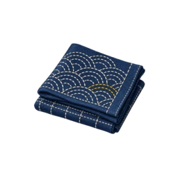
A bright white thread can look harsh on oatmeal or undyed cloth, while a beige thread may disappear on a warm ground. Place every candidate directly on the textile.
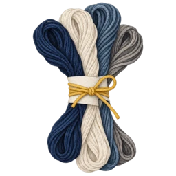
Look for a first shade that is clearly visible without overwhelming the fabric. The rest of the palette can move lighter, darker, warmer or cooler from that anchor.
Build a simple hierarchy
Use the strongest contrast for the main motif, a middle neutral for secondary rows and a quiet shade for borders or small accents. This keeps the design legible without bright colour.
Grey and brown can separate white rows more gently than black. If the project will be washed often, check that the selected neutrals still read when the cloth is damp or softened.
Keep records for repeat work
Stitch a small sample with labels beside each row. This creates a practical reference for future patches, matching repairs and additional panels.
Neutral palettes are especially sensitive to surrounding colours. Photograph the sample against the garment or cloth so a future choice is based on the real context rather than memory.