

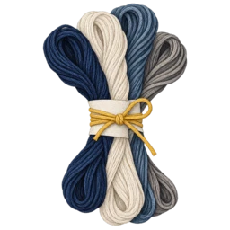

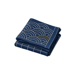

Set the contrast first
Place the thread on the actual fabric, not only against a white colour chart. A blue that looks distinct in the shop may become subtle on indigo.
Choose one anchor shade that is easy to see, then add darker, lighter or warmer neighbours. This gives the pattern a visual spine before you add quieter accents.
Use temperature as well as lightness
A greyed blue, green-leaning blue or violet blue can separate rows even when their brightness is similar. Natural white and warm neutrals can also make an indigo field feel less flat.
Keep the palette narrow when the pattern is intricate. Too many close blues can hide the rhythm of the stitch and make the finished textile harder to read.
Sample the wash and light
Thread and cloth can change in apparent contrast after washing and drying. Make a small colour strip and view it in daylight before committing to a garment or large panel.
Record the colour order and brand. A useful palette is easier to repeat when you can identify the exact shade that gave the sample its balance.